Wes Anderson is an auteur of films like Bottle Rocket (1996), Darjeeling Limited (2007), Fantastic Mr Fox (2009), The Grand Budapest Hotel (2014), and French Dispatch (2021). His films are popular and admired for their distinctive look, atmosphere, and sound.
The Wes Anderson style found fame on the Internet, too. One of the earliest examples of the trend on TikTok is a video by Ava William, which compiles dreamlike, sunset-orange filtered footage of her train ride. It has been liked more than 2.3 million times at the time of writing. Even Singapore’s Minister for Health, Ong Ye Kung, has filmed a Wes Anderson-style Tiktok video titled Mornings At Ministry of Health. These videos replicate Wes Anderson’s vivid and pleasing candy-coloured palettes, symmetrical frames and precise object placement.
This blog explores two iconic characteristics of Wes Anderson’s films and explains why his style and branding are so iconic and well-loved.
1. Wes Anderson Font
One hallmark of Wes Anderson’s films is his font choices. They are so popular that designers have compiled lists of fonts that look similar to the ones used by Wes Anderson! Good fonts are fundamental to effective and memorable design because they help subtly convey messages and themes. Wes Anderson’s retro font choices showcase his quirky and whimsical style. They also hint at the genre and mood of the film narrative.
Here are a few examples. Consider the flowing, cursive font used in Moonrise Kingdom, specially designed by Jessica Hische for the film. Vintage 60’s American typefaces inspired this font style. It elicits feelings of elegance and nostalgia.
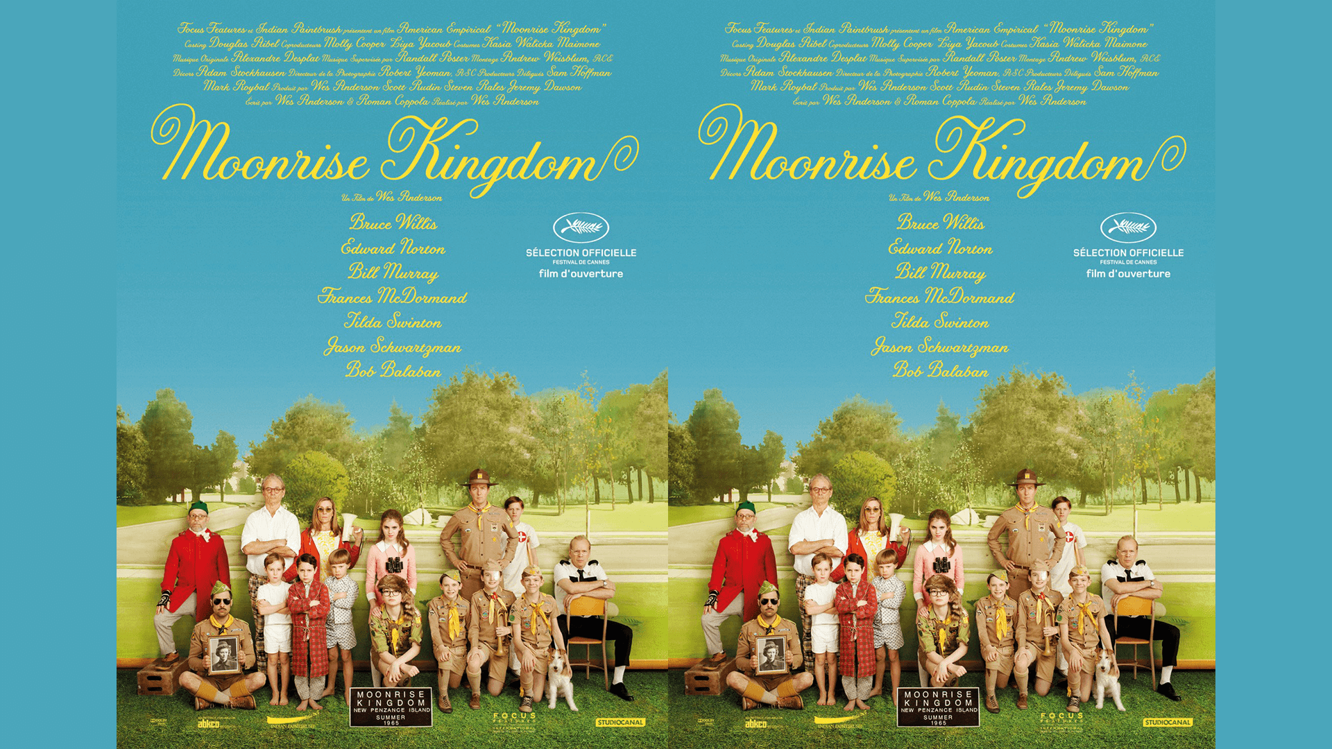

Font styles evoke different emotions and meanings. For instance, the serif font used in Moonrise Kingdom has extra details at the end of each letter – the curlicues and ‘tails’ – often used by vintage or luxury brands. A soft, vintage-looking font is thematically appropriate for Moonrise Kingdom, which is a classy and nostalgic story about the tenderness of growing up. This font was later commercially released with the name Tilda.
Another example is the font used in Wes Anderson’s latest film about UFOs in a deserted 1955 American town, Asteroid City, starring Bill Murray and released by Focus Features.

The chunky, retro font fits the film’s science-fiction comedy genre. It is a straightforward sans-serif typography design without curlicues and represents a laid-back, friendly appearance.
Moving on, The Grand Budapest Hotel boasts an ornate, gold-trim font emphasising the hotel’s fairy-tale dollhouse quality. The designer, Annie Atkins, took heavy inspiration from 1930s Eastern European typefaces on metal signs.

Wes Anderson favours nostalgic fonts, which have become synonymous with his style. He is also consistent with his fonts in films – did you know that The Royal Tenenbaums depicted all text and printed material in Futura? It included books, signs, posters, the film’s credits, and the title, among other instances. Anderson is particularly fond of Futura and used it in nearly all his movies!
However, he also varies his fonts to hint at the mood and genre of the film. It’s an example of excellent branding! Great branding uses varying stylistic choices to subtly capture different themes and messages while retaining a consistent and recognisable look.
2. Wes Anderson Color Palette
Wes Anderson’s palette sets his films apart from others. His set design, colour grading, and detailed props make his films a visual treat. Anderson’s films frequently feature frames or scenes staged like cinematic tableaus. Campy colours and whimsical motifs inspired an Anderson Aesthetic Collection by MuralsWallpaper.
Wes Anderson’s use of colour is recognisable because he subverts traditional colour theory. His penchant for depicting sad events in bright, pastel-coloured hues is an example. His characters go through distressing or dark experiences while living in a world that resembles a children’s picture book. It lends a quirky and discordant, off-kilter personality to the film.
Consider the example of Wes Anderson’s 2014 film The Grand Budapest Hotel’s exterior introductory shot. It is a quaint pink hotel nestled amid dark and gloomy mountains. The unexpected colour scheme makes the hotel facade look striking and provides the perfect backdrop for the aesthetically pleasing mystery plot that ensues.
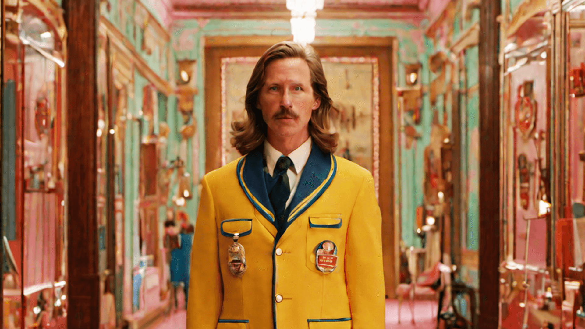
The Grand Budapest Hotel was widely applauded for its creative and visually arresting costume design. The instantly recognisable jewel-purple lobby boy uniform is regarded as one of the most iconic costumes in Wes Anderson’s oeuvre.

Pastel colours are a staple of the Wes Anderson palette. They have become a defining hallmark of the Wes Anderson brand – consider the pastel pink exterior of the hotel, the candy-coloured icing of the Courtesan au Chocolat pastry in The Grand Budapest Hotel, or the baby blue uniform of Owen Wilson’s character in The Life Aquatic with Steve Zissou (2004), a film about an oceanographer.
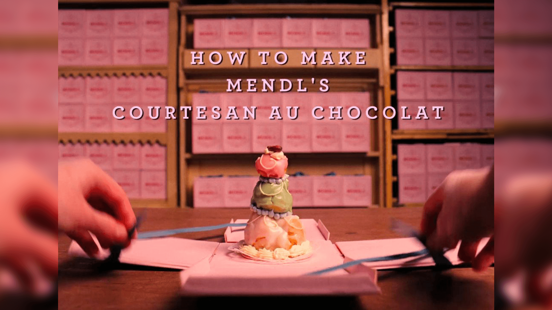

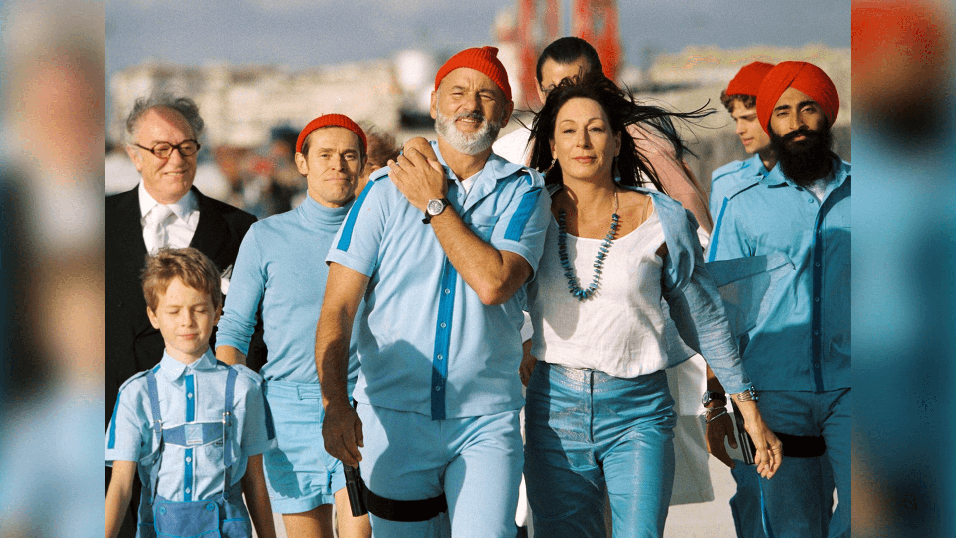
Wes Anderson’s vibrant colour palette uses a rhythmic narrative tone to complement film beats and convey mood. His colour choices have even inspired a blog entirely dedicated to posting about colour palettes in his movies!
The following stills in The Royal Tenenbaums (2001), a film about a dysfunctional family, showcase Wes Anderson’s attention to visual consistency in colour and design.

This frame has a consistent colour palette of rustic, warm, red-brown hues. The gold and yellow of the suit and sofa balance out the red walls. The couch, bookcase and lamp placement are nearly symmetrical. The two characters – Richie and Margot Tenenbaum – are seated at the centre of the frame, creating a visually pleasing and satisfying shot.
Red and yellow are important shades in this film and say something about each character. Elsewhere in the movie, these shades repeat themselves in character costumes. Margot dons an iconic yellow and gold-hued fur coat, and Chas wears an iconic red tracksuit. While red is vibrant and energetic, Wes Anderson uses it to express anger and pain in his films. It is an example of how brands use specific colours to represent motifs in their brand story!
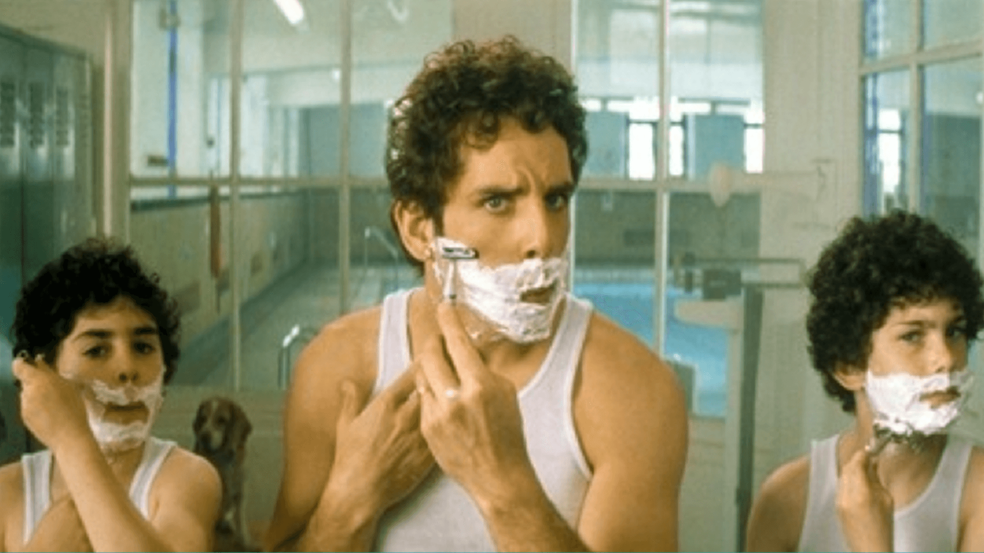
Similarly, this frame uses symmetry and colour consistency. The white walls and clothing complement the pool’s pale, cool blue tones and glass panes. Two shorter children of similar height flank the taller father to create a symmetrical shot. Wes Anderson’s exact framing makes his films pleasant to watch and appreciate.
What can Brands Learn from Wes Anderson?
Wes Anderson’s use of colour, font, and other design elements has enabled him to create a ‘Wes Anderson Style’ that has become his brand. You can learn how to boost your brand by taking a few tips from his films.
1. Consistency Is Key
Define a design or visual element for your brand and stick to it. These graphic elements should embody your brand’s traits. Over time, people will subconsciously associate your brand with specific designs and styles. Consistency with your colours, font choices and narratives helps you build a recognisable brand.
2. Don’t Be Afraid To Stand Out
Wes Anderson’s films differ from the typical Hollywood blockbuster movies that dominate the box office. Despite this, he has a devoted audience who appreciate his style.
Instead of trying to brand yourself as the next big thing on the market, your business could establish a niche. You may not have instant mass appeal, but you will build a loyal audience base over time. These are the consumers who love your brand for all its eccentricities and quirks.
Conclusion
As we have seen, font, design, and colour palette are integral to Wes Anderson’s style and brand. Consider focusing on these aspects of your branding and create a recognisable brand image that helps you stand out!





































 Branding
 Digital Strategy
 PR & Communications