How is Marketing Changing in the Digital Age?
A 2022 survey by Global NewsWire reported that 95% of online customers read Internet and social media reviews of products and services before buying. The digital age has shifted many businesses’ marketing strategies to focus on online engagement.
Marketing automation software helps you collect valuable customer data, such as online event reviews, to improve marketing campaigns and customer experiences. It also helps you plan, manage and promote your offline events on social media.
This blog explains the 3 benefits of marketing automation events for your business.
How Does Marketing Event Automation Work?
Marketing automation for events uses specialised marketing automation platforms to launch and manage events. The software also tracks customer journeys and preferences.
It’s essential for scaling and maintaining your business’s competitive advantage.
3 Benefits of Implementing Marketing Event Automation
1. Better Customer Personalisation
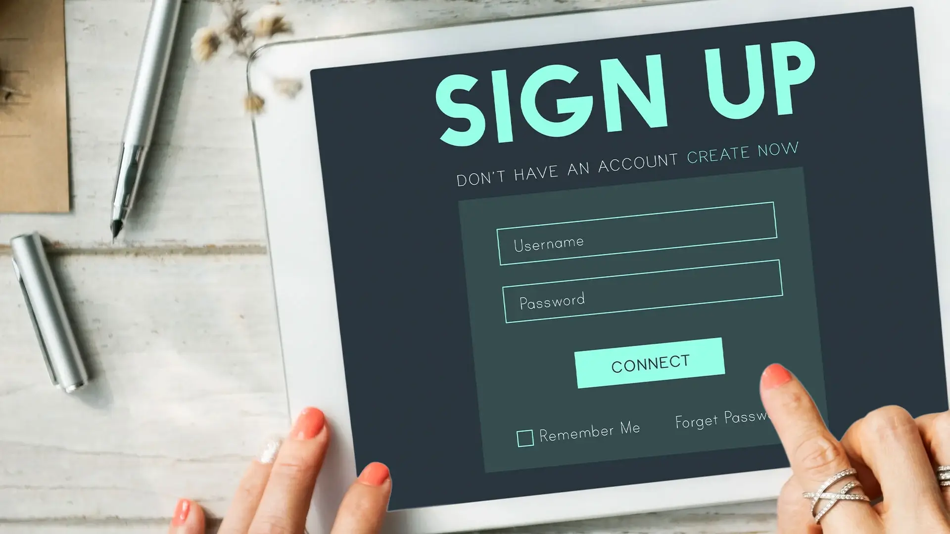
Automated Data Collection
Collecting registrant data is essential for planning any event. However, the process is also prone to error due to the high volume of information and accuracy needed. A marketing automation platform helps you record and organise data much faster than a person can.
The best part is that you won’t have to manually monitor or approve the registration process. You only need to provide a link and let participants key their details into a form. The automated marketing software will record it for you.
Sharing participant data early
What if there was a way to know what your attendees want before they attend your event?
Marketing automation shares early participant data with your marketing team and other organisers. This information collection process can begin months in advance before the actual event. You can use this data to refine your event early to suit your registrants’ preferences and behaviours better.
Automated data collection and analysis helps you understand:
- Whether your registrants are mostly customers or prospects.
- How attending customers use your product or service.
- Background and demographic of your registrants.
- Job roles and types of companies your registrants work at.
- How long have your registrants engaged with your business?
Here’s an example of an automated data collection workflow:
- A registrant signs up for an event on your landing page. They submit their details in a form.
- The automated software system collects and stores the registrant’s data in a data warehouse.
- The data warehouse automatically shares registrant information in your business’s communication channel.
- You and your team can review the information.
You can also use the collected data for other marketing efforts, e.g., creating content that meets your target audience’s needs.
2. Streamlining Operations and Increasing Efficiency
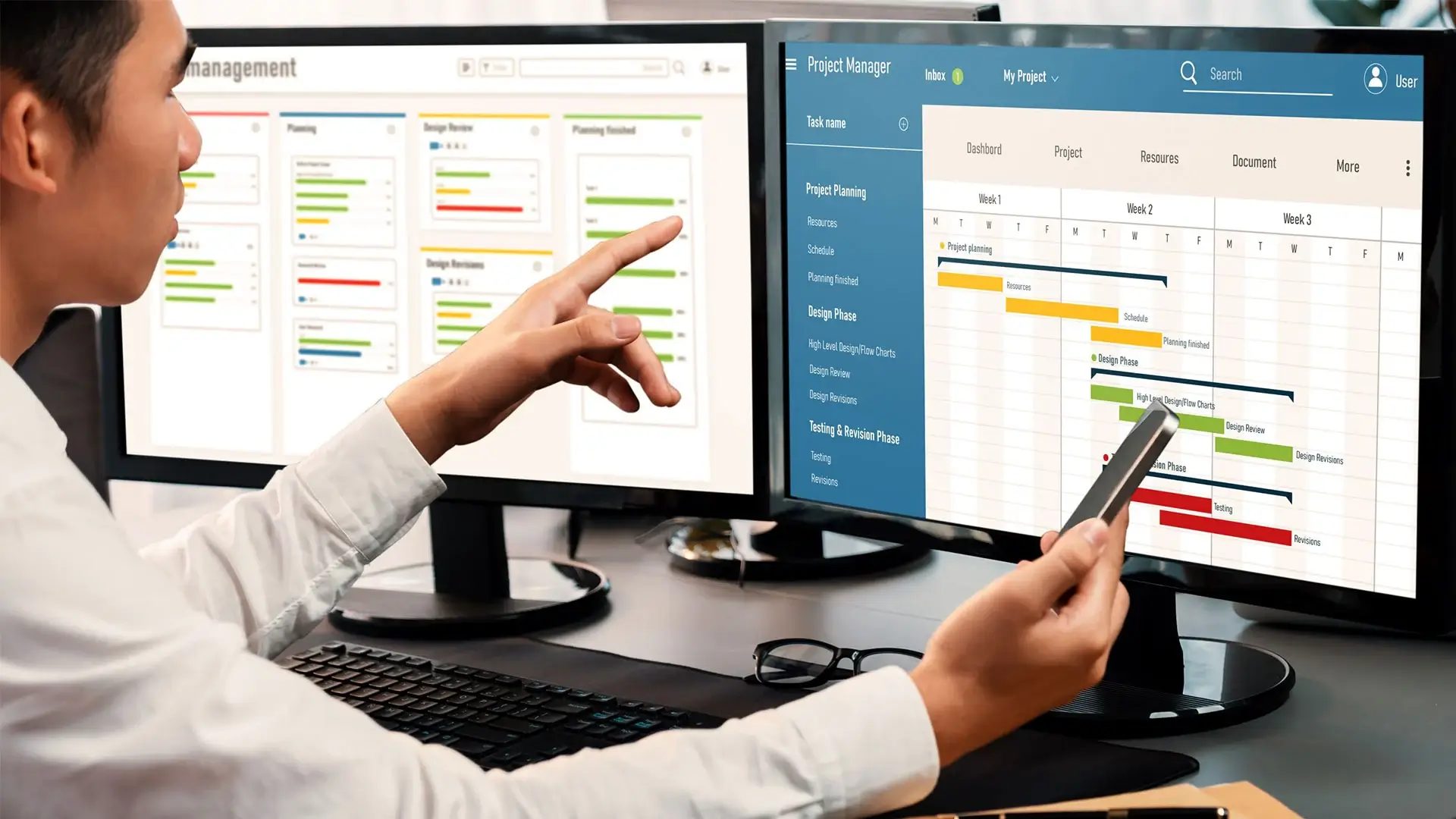
Event planning and preparation
Planning an event involves many tasks. You must promote the event, create guest lists, develop promotional content, contact guest speakers, and more.
Marketing event automation expedites manual processes to increase event preparation and promotion efficiency. No more stressing over routine operational tasks.
Automated marketing event software helps you:
- Collect registrations through online forms
- Collect payments through third-party payment gateway integration
- Manage invoices and receipts
- Set ticket prices
- Automated emails, e.g., confirmation emails
- Create guest lists
While your software automates these pre-event processes, you and your staff can focus on contacting people and planning the event.
Automated event promotion
After all the hard work you’ve put into planning and scheduling an event, you must find attendees. Social media promotion is the best way to get the word out about your event.
Manually posting promotional content online involves a lot of copy and pasting. You don’t have to spend precious time doing that. Automated marketing software can generate buzz around your event by cross-posting promotional content on all your linked social media platforms.
3. Data-Driven Decision Making

How does automation benefit customers?
Every business owner knows that customer data is essential for making business decisions. Data-driven marketing helps you personalise your content, products and services to fit your target audience and improve customer loyalty.
As mentioned, automated event software provides the data needed to adjust your marketing campaigns.
One example is collecting and tracking customer feedback during and after an event. It is difficult to collect hard copy forms from attendees while the event is ongoing, and people may need more time to provide useful information in feedback questionnaires.
An automated online survey allows them to provide answers when they’re free, improving the quality of the responses you get. You’ll also collect their contact information, useful during lead generation.
Here’s an example of an automated response collection workflow:
- Participants receive an email containing a link to an automated or computerised survey during or after the event.
- The survey asks them questions about what they learned and why they wanted to sign up.
- The participant submits the survey. Their responses are automatically saved to a data warehouse or shared with your business’s communication channel.
Conclusion
Now, you may be wondering: can marketing automation work for a small business?
Yes, all types of businesses can use marketing automation. A digital agency will help you create a strategy that fits your business scale.
MIU runs marketing event automation strategy for several of our clients. Contact us or visit our website to discover what we can do for your business.



 Branding
 Digital Strategy
 PR & Communications